
Or maybe they just used different suppliers through the years.


Or maybe they just used different suppliers through the years.
1969 911S
1969 Datsun 2000...worth less, but more valuable
Well, I might as well throw a wrench in the mix here. I found my vellum and made more than a few measurements. I did a pretty good job of tracing because my measurements are very consistent.Originally Posted by HughH

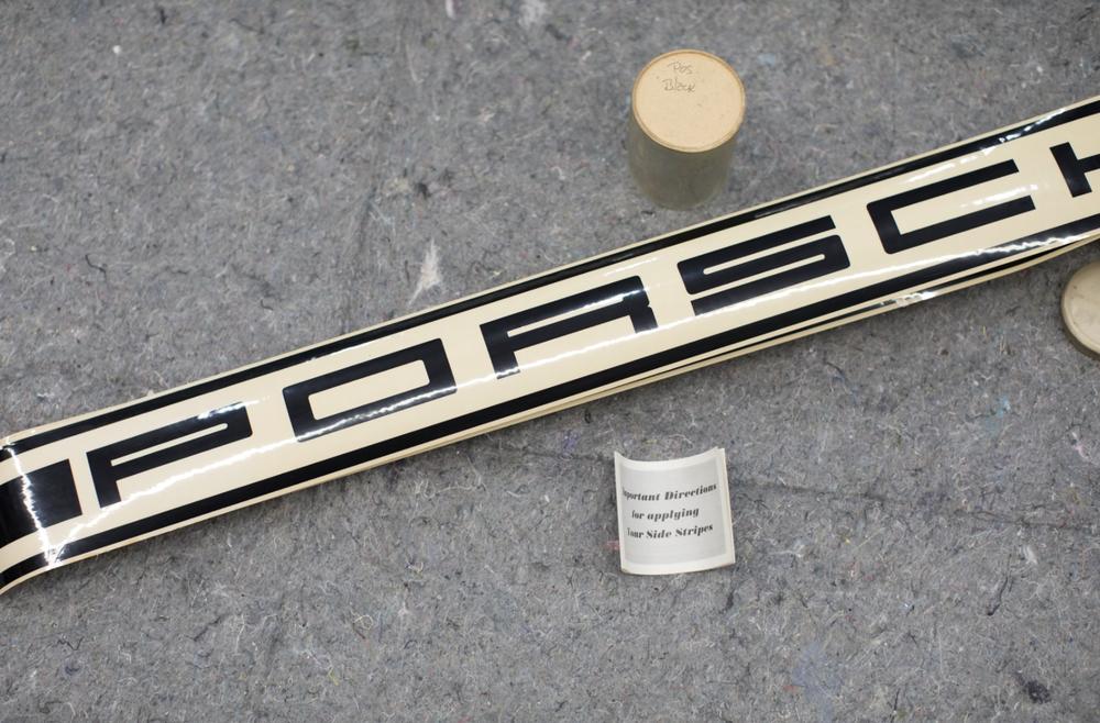
From what I remember of the doors, the stripes had significant patina that matched the rest of the doors so, if not factory applied, very soon after.
I made one assumption in my dimensioning. I don't believe that Porsche would have messed with fractional millimetres except in two instances (I'll let you guys guessand all of my measurements were converted to whole millimetres. While I haven't calculated the overall width of the Porsche name and compared to a physical measurement, I'm pretty confident I'm correct.
So, guess what??? My stripes had letters that were 40 mm x 110 mm (overall outside dimensions). Spacing between the letters is 26 mm. The spacing between the stripes and the font is 15 mm (symmetrical) and the stripes themselves are 10 mm wide.
I cannot discount a scenario wherein the stripes Bob used as an example had a defect in manufacture. So, possibilities,,,,
What was the vintage of Bob's example?? Were all of the stripes made in Germany and shipped to various countries or could it be that files were sent to different regions and the stripes made locally??? Heck, I don't know. However, I highly doubt a number of German Engineers would have allowed an asymmetrical design of the spacing of the stripes in relation to the font. That's my gut talking.
Last edited by 70SATMan; 01-27-2021 at 11:59 AM. Reason: Edited letter spacing measurement
Michael
Electricity is really just organized lightning
-Dusty 70S Coupe
-S Registry #586
Michael
I can only give you the approx date of Bob's decals I put them on in very late 2012 (I think at Christmas time) so I presume a month or two before that but I dont recall how long I had them before I put them on - i dont think long. So maybe October 2012?
but also the look of the ones on your yellow doors is, to me, quite different to the factory photos I have from 1970 and earlier.
Hugh Hodges
73 911E
Melbourne Australia
Foundation Member #005
Australian TYP901 Register Inc.
Early S Registry #776
G'Day Michael, thanks for throwing another spanner in the works! I have found this quite interesting after having drawn your specified dimensions on CAD, the overall width of the 'Porsche' translates to 962mm overall width whilst Bob's is only 937 based on Hugh's accurate dimensions as well. As mentioned somewhere on this thread, the wider it is; the more problematic it becomes when applied on the door as the letters begin to 'seep' out beyond the lower door edges whilst moving it higher to compensate for the increased width, dramatically affects its appearance on the car and therefore conflicts with its aesthetics. Do bear in mind this notion only applies to the 911 door. I do also agree with your statement 'I highly doubt a number of German Engineers would have allowed an asymmetrical design of the spacing of the stripes in relation to the font'
For the record, dimensions are the +/- 1 mm for both Hugh and your dimensions for the fonts but your 32mm spacing between the fonts is the most 'major' difference which as mentioned above; spreads out the 'Porsche' word quite widely. Whilst the spacing on Bob's as per Hugh's dimensions, are quite varied and asymmetrical. Thanks everyone for participating in this nerdy discussion.
Last edited by al agustin; 01-27-2021 at 01:18 AM.

If you read the original thread from Bob you'll see the NOS decal that he scanned. That particular decal clearly has more of a gap between the bottom stripe and the letters than it does between the top stripe and the letters.
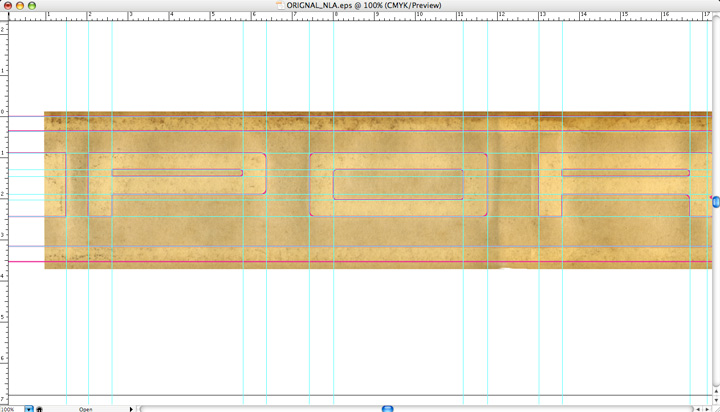
I must have missed this one...this is very, very convincing that those German Engineers did engage in the unholy act of doing something asymmetricalIt even clearly shows the the distance between the P and O is different between the O and R. It appears the width of the vertical lines of the fonts are more than 10mm as well!
Michael?
Last edited by al agustin; 01-27-2021 at 08:14 AM.
Al, I sent you an email...
I only traced one of my doors back then so, can't average anything out except the letters themselves on the one vellum. Also, when I made my trace, I only traced line connections and radius curves so that I could finish the straight line work on my drafting table. I've made quite a few measurements as I've said but, haven't drawn out the whole thing which I intend to do shortly. I only drew out the "R" before posting,,
So, here's the thing... Aside from the addition of the stripes, we are talking about a FONT and Font's don't always make sense. Usually a font is defined and only changes in SCALE. Of course we know the Porsche "logo" changed over the years. Even the letters on our early cars changed and some of that had to do with MANUFACTURING because maintaining an accurate scale doesn't always make sense.
I do acknowledge that my example was obviously well aged and given the material, is likely to suffer from shrinkage, etc. I'll report back on the thread once I've drawn it out physically and again made several measurements again.
What is not going to change from my information is the top/bottom spacing of the stripes in relation to the font on my example. I noted the spacing at the points where the center stripes start fore and aft of the font and in relation to each letter. There is no real variation on this single door example. For sure symmetrical spacing and the closest whole mm measurement is 15mm (assumption). No way my tracing is off 4mm on one side.
Tracing was with a .5mm mechanical pencil straight to vellum. I'll be back with more info for all.
Michael
Electricity is really just organized lightning
-Dusty 70S Coupe
-S Registry #586
And we know that this decal wasn't flawed how????
Michael
Electricity is really just organized lightning
-Dusty 70S Coupe
-S Registry #586
I can't speak for Bob, but I believe that it was still in the factory tube and never installed. That's not to say that it wasn't flawed from the factory. We certainly could use another data point.
I've made arrangements to purchase this NOS script and have it scanned.
It's also possible that the earliest version of these decals may have had more space between the bottom stripe and the text because the intended use was on cars like the 911R which didn't have rocker moldings. Those cars had the scripts lower with the door line running between the lower stripe and the text.
Perhaps later when they became popular the gap was adjusted because the scripts were installed above the door line due to rocker moldings. The fact that the difference is 4mm on the non-symmetrical scripts aligns with the fact that factory door gaps are 3-4mm.
 Posting Permissions

 Reply With Quote